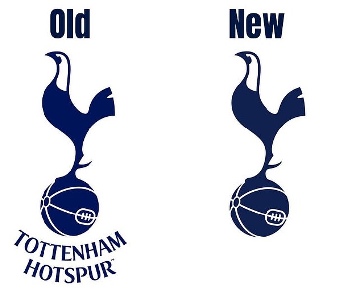
Tottenham have redesigned their club badge in an attempt to inject the club's brand with a 'playful, bold approach' – but the differences between the two silhouettes are proving to be a challenge for fans to spot.
The North London side have used their iconic rooster logo since the early 1920s, and it has featured on all versions of the crest since.
Spurs have been using the most recent version of their badge – a sleek modern design – since 2006, with occasional tweaks.
But the latest version of the club's crest has taken minimalism to new heights.
In a press release shared on Monday, the party shared that, together with branding specialists Studio Nomad, they had been working on a complete renewal of their 'brand identity' for nine months.
The aim, the club says, is to embrace 'its rich history and undeniable heritage'.
The old design features the rooster on a vintage-style football with the words 'Tottenham Hotspur' underneath in the club's rich navy blue.
The new design may rub fans in the eye as to where the changes have been made, but one of the most obvious changes is the removal of the club's name.
Another is the slight darkening of the navy blue, a change that Tottenham say has left the silhouette 'standing prouder than ever'.
But while supporters may still be scratching their heads over the need for the updated crest, manager Ange Postecoglou has thrown his support behind the revamp of the club's image.
“We want to be a certain type of football club – we want success like everyone else, but we want to get there our way,” the manager said of the new designs.
'The brand stands for constantly challenging what you do and looking for an edge. If you do it right, you create something special.'
The club's executive director, Donna-Maria Cullen, added: 'This is a club that drives, forges, innovates and is relentless, both on and off the pitch. This phenomenal exercise was about unifying, defining and elevating.
'The reimagined brand embraces all the excitement, all the innovation and shows that we're going to be brave, we're going to be exciting and we're going to have fun – this is where we need to be with our brand, right? now.'
In addition to the new badge, the club is introducing the THFC monogram reminiscent of the club's images from the late 20th century, updating fonts and colors and introducing 'new patterns and features linked to the heritage of the club'.
Tottenham fans will hope this reinvented vision will inspire their players as they enter the international break having lost to Galatasaray in both the Europa League and Ipswich Town in the Premier League.
The club are currently 10th in the standings and will travel to champions Manchester City at the Etihad this weekend as domestic football returns.
